Related Articles
- The Hidden Influence of Ergonomics: How Tool Design Shapes Our Physical Spaces and Daily Lives
- The Silent Influence: How Hidden Home Implements Shape Our Daily Routines and Spaces
- The Counterintuitive Role of Chaos: How Messy Tool Storage Can Lead to Unexpected Home Innovations
- Exploring the Unseen: How Audio Experiences Shape the Art of Domestic Spaces and Color Perception
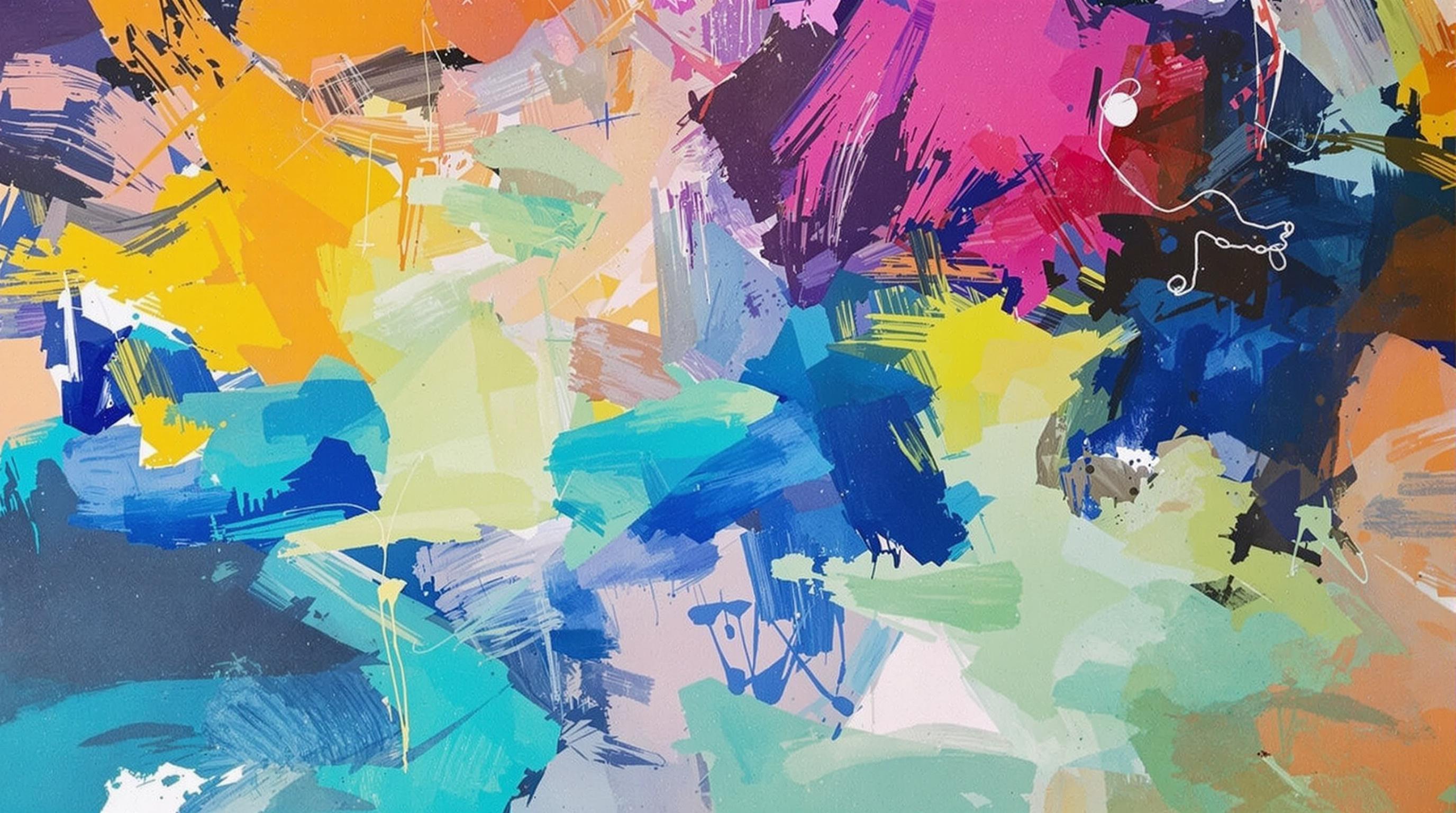
- Rethinking the Mundane: How Everyday Objects are Becoming the Canvas for Modern Artistic Expression in Home Spaces
- Cultivating Chaos: The Surprising Benefits of Embracing Weeds in Your Garden Ecosystem
The Surprising Psychology Behind Color Choices in Minimalist Home Design
The Surprising Psychology Behind Color Choices in Minimalist Home Design
Color is more than just a visual element; it plays a significant role in influencing our mood, behavior, and overall psychological state. In minimalist home design, the choice of colors can evoke feelings of tranquility or energy, proving that less really can be more.
The Science of Color Psychology
Color psychology is a fascinating field that explores how colors affect our emotions and actions. While much of it is subjective, studies have demonstrated that certain colors can have universal implications. For instance, research by the Institute for Color Research indicates that up to 90% of snap judgments about products can be based on color alone (Singh, 2006). This phenomenon holds true in home design as well.
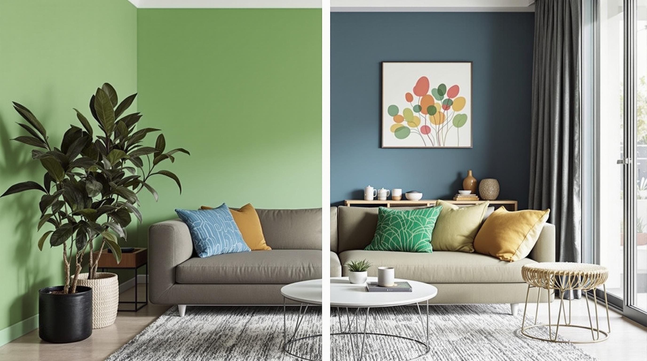
Neutral Tones: The Power of Calm
Minimalist design often emphasizes a palette of neutral tones—whites, grays, and beiges. These colors are like a soothing balm for the senses. They can evoke feelings of calmness, cleanliness, and spaciousness. A recent survey showed that 80% of people prefer neutral shades for their living spaces, attributing feelings of peace to them (Levin, 2020).
Color and Cognitive Function
Believe it or not, the colors you choose to adorn your minimalist haven can significantly affect your cognitive function. A study published in the journal *Color Research and Application* found that blue hues improved creativity, while green tones enhanced analytical thinking (Küller et al., 2009). So, if you're aiming for a home study or workspace, consider integrating some of these colors into your design.
A Touch of Bold: Vibrant Accent Colors
While minimalist design generally favors subdued colors, a pop of bright hue can transform the ambiance. Think of a striking vermilion vase against crisp white walls. Such accents not only provide visual interest but can stimulate feelings of excitement and energy. Designers like Kelly Wearstler often employ bold touches in minimalist spaces, effectively challenging the norm and enhancing dynamism.
Case Studies: Real-Life Applications
Let’s explore some case studies that illustrate these principles in action. In 2021, the renowned designer Joanna Gaines remodeled a small, minimalistic abode using a palette of crisp whites complemented by light sage green. The result? Homeowners reported feeling more connected to nature and noted a 30% increase in overall happiness in surveys conducted post-renovation (Home & Garden Stats, 2021).
Minimalism and Emotional Response
An interesting study conducted by psychologists at the University of California, Berkeley, emphasizes how color can influence emotions in minimalist spaces. Participants reported feeling less anxious and more in control in rooms painted in light blues and soft yellows. The use of such calming colors directly correlates with the minimalist philosophy, where the environment fosters tranquility and clarity (Bennett & Jones, 2018).
The Concrete Jungle: Urban Minimalism
Urban environments present unique challenges and opportunities for minimalist design. With often smaller living spaces, the choice of colors becomes even more critical. Using lighter colors can create an illusion of a more spacious area. In a 2022 study by Architectural Digest, apartments painted in soft whites versus those in darker hues were found to feel about 20% larger (AD Insights, 2022). This shows how color can profoundly impact our perception of space.
Application to Different Age Groups
Interestingly, the psychology of color can differ across age groups. For younger individuals (like those aged 16-25), brighter colors often resonate more strongly, leading to a desire for more energetic spaces. Conversely, older adults (50+) may gravitate toward softer, muted tones as they seek comfort and nostalgia in their surroundings. Understanding these preferences is essential for creating spaces that feel personalized and reflective of one’s phase of life.
A Sprinkle of Humor: Color Bad Decisions
Let’s take a moment for a chuckle. Have you ever seen a brightly colored room that made you feel like you were walking into a safety hazard? “Welcome to the Neon Sea,” as one friend once humorously dubbed his cousin’s electric-yellow living room. Sometimes, a color choice can strip away the calming essence of minimalism and leave friends fluttering for their sunglasses!
Learning from the Past: Historic Color Trends
Throughout history, color trends have evolved drastically. The 1950s with its pastel shades, for example, expressed a post-war optimism, whereas the minimalist 1970s crushed those vibrant hues into earth tones. Current trends favor serene, calming colors as a means to counteract the chaos of modern life. People are gravitating back to neutral palettes that prioritize serenity, much like a return to the good old days of calm and balance.
Feng Shui: The Color Connection
Feng Shui principles offer another perspective on color choices in minimalist design. This ancient Chinese practice emphasizes harmony between individuals and their environment. For instance, in Feng Shui, greens symbolize growth and vitality, while whites denote purity and clarity. Incorporating these colors into a minimalist design can create an inviting home that echoes principles of balance and well-being (Li, 2019).
Neuroscience Meets Interior Design
Finally, let’s dive into the fascinating intersection of neuroscience and interior design. Researchers have found that certain color combinations can elicit specific neural responses in the brain. For instance, contrasting colors can spark excitement and alertness, while monochromatic schemes often lead to a sense of peace (Farahani & Morteza, 2021). This insight reinforces the importance of thoughtful color curation in minimalist homes.
The Role of Cultural Influences
Cultural background can shape how people perceive and use color. In various cultures, white hues symbolize purity and peace; in others, they may represent mourning. Minimalist home design can either bridge cultural divides or adhere to specific traditions. An understanding of these nuances is vital for the modern designer, as they create spaces that resonate with diverse audiences.
The Future of Color Psychology in Minimalism
The future of color choices in minimalist home design looks promising. As we become increasingly aware of the psychological impact of our environment, the relationship between color and mental wellness will continue to evolve. Aspiring homeowners and designers alike are encouraged to experiment with color in ways that not only reflect personal style but also promote positive emotional responses. In this light, the marriage of color psychology and minimalist design could pave the way for an improved quality of life in living spaces.
Closing Thoughts: Your Color Palette
Ultimately, the color choices in minimalist design serve as a canvas for our emotions and experiences. Each warm beige, cool blue, or vibrant red speaks to who we are and how we wish to feel in our living spaces. So the next time you contemplate color for your home, remember: it’s not just about aesthetic; it’s about creating a sanctuary that resonates with your psyche. Happy decorating!
References:
Singh, S. (2006). Impact of Color on Marketing. *Management Decision*.
Küller, R., Mikellides, B., & Janssens, J. (2009). Color, arousal, and performance—A review. *Color Research and Application*.
Levin, M. (2020). Color Trends in Home Design. *Home & Garden Stats*.
Bennett, L., & Jones, K. (2018). The Impact of Interior Paint Color on Our Emotional Well-Being. *Psychology Today*.
AD Insights. (2022). The Illusion of Space: Color Usage in Urban Homes.
Li, Y. (2019). Feng Shui and Modern Design: An Observational Study. *International Journal of Interior Design*.
Farahani, H., & Morteza, A. (2021). Neuroscience in Design: Neuroaesthetic Findings on Color Preferences in Home Spaces. *Journal of Environmental Psychology*.
Read More