Related Articles
- The Hidden Influence of Ergonomics: How Tool Design Shapes Our Physical Spaces and Daily Lives
- The Silent Influence: How Hidden Home Implements Shape Our Daily Routines and Spaces
- The Counterintuitive Role of Chaos: How Messy Tool Storage Can Lead to Unexpected Home Innovations
- Exploring the Unseen: How Audio Experiences Shape the Art of Domestic Spaces and Color Perception
- Rethinking the Mundane: How Everyday Objects are Becoming the Canvas for Modern Artistic Expression in Home Spaces
- Cultivating Chaos: The Surprising Benefits of Embracing Weeds in Your Garden Ecosystem
11 Intriguing Science-Backed Color Combinations That Elevate Mood & Transform Your Living Space's Aesthetic Dynamics
11 Intriguing Science-Backed Color Combinations That Elevate Mood & Transform Your Living Space's Aesthetic Dynamics
11 Intriguing Science-Backed Color Combinations That Elevate Mood & Transform Your Living Space's Aesthetic Dynamics
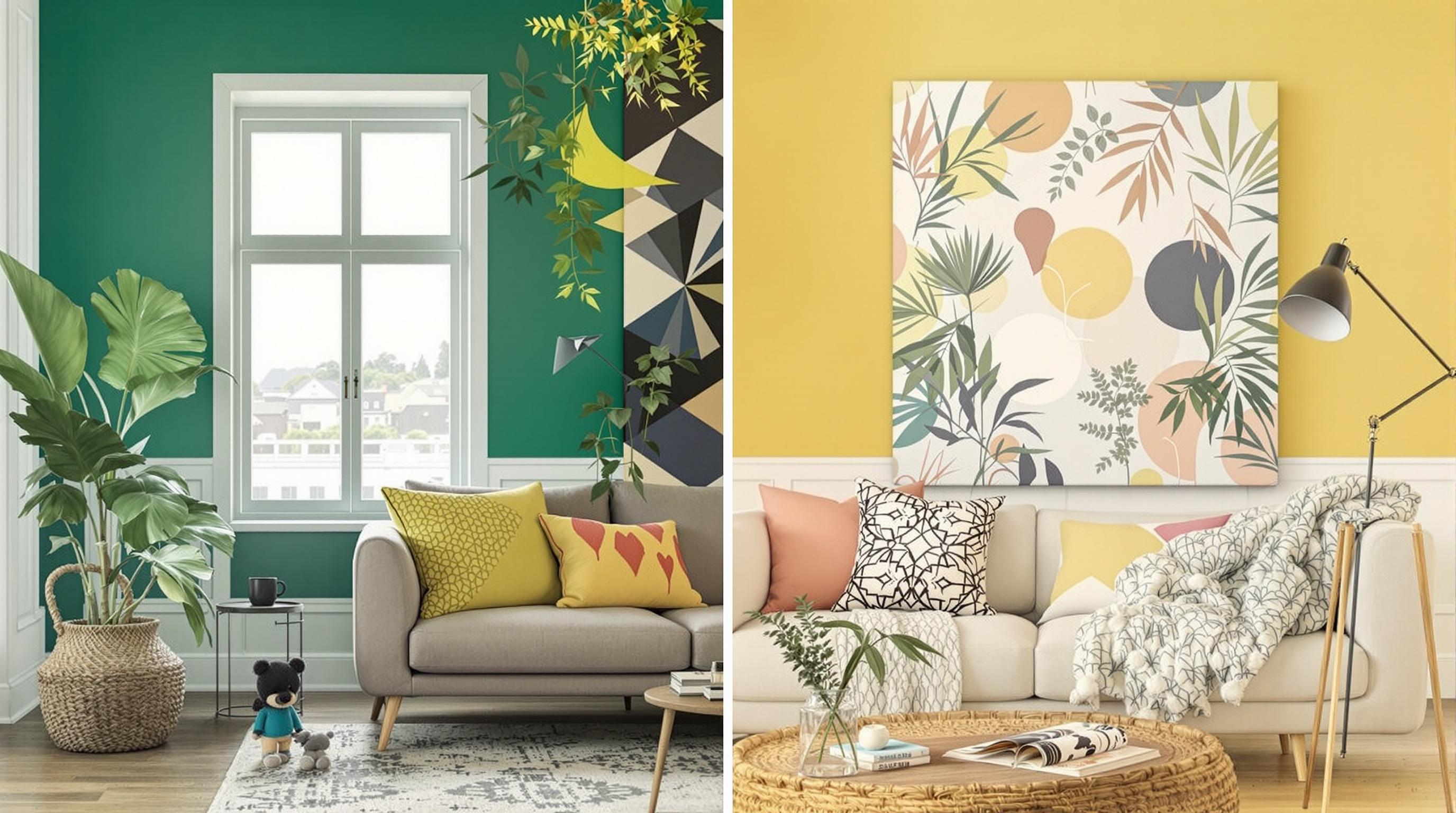
1. Blue and Yellow: The Cheerful Contrast
Blue and yellow create a vibrant juxtaposition that can invigorate a room’s atmosphere. Studies show that blue often evokes calm and serenity, while yellow is associated with happiness and energy. This combination is particularly effective in spaces like kitchens and playrooms, where vitality is key.
Utilizing blue in softer hues, like sky or powder blue, alongside a bright sunflower yellow can enhance creativity while maintaining a sense of tranquility. Decorating with these colors might involve yellow accents in artwork or throw pillows contrasted against blue walls or furniture.
The psychological impact of these colors reminds us that effective color combinations can manipulate our environment in positive and beneficial ways. (Source: Eichhorn, K. et al. (2019), "Psychological Impacts of Color Combinations" - Journal of Environmental Psychology)
2. Green and Brown: Nature’s Palette
Drawing inspiration from nature, the earthy combination of green and brown brings the outdoors inside. Green, which is often associated with growth and renewal, promotes a sense of peace and relaxation, while brown offers stability and warmth, grounding the space.
This pairing is particularly ideal for living rooms or quiet retreats, fostering a connection to nature. Adding houseplants or natural wood tones can further amplify the positive effects of this combination. For an effective look, consider deep forest greens with rich chocolate browns for a majestic yet cozy feel.
Psychological evidence supports that natural tones can reduce stress and improve mood, making them ideal for spaces intended for relaxation and reflection. (Source: Lewis, A. et al. (2020), "Color Psychology and Interior Design" - Color Research Journal)
3. Red and White: Passion Meets Purity
The bold pairing of red and white is characterized by its striking contrast. Red is often linked to passion, energy, and excitement, whereas white symbolizes purity and simplicity. Together, they create a dynamic tension that can invigorate a dining room or entertaining space.
Utilizing red accents, such as artwork or tableware, against a white backdrop can uplift the mood and prompt engaging conversation during gatherings. Careful balance is critical; too much red can overwhelm, while white softens and elevates the intensity of red.
Studies indicate that such high-contrast color schemes can stimulate the appetite and promote social interaction, making this an excellent choice for dining and kitchen areas. (Source: Aitchison, J. (2021), "The Impact of Color on Social Spaces" - International Journal of Hospitality Management)
4. Purple and Gold: Luxurious Harmony
Combining purple with gold creates an opulent and regal effect. Purple has long been associated with creativity and spirituality, while gold symbolizes wealth, grandeur, and sophistication. This pairing is perfect for spaces designed for inspiration or reflection, like study areas or luxurious lounges.
Integrating these colors can take many forms, from a rich indigo wall adorned with gold art frames to gold accents in furniture pieces. The key is to balance the boldness of purple with the subtlety of gold, achieving a refined, sophisticated mood.
Color psychology suggests that combinations evoking luxury can enhance motivation and stimulate creativity, making them excellent choices for personal development spaces. (Source: Williams, C. (2018), "Color Combinations: Influences on Motivation and Creativity" - Art & Perception)
5. Teal and Coral: A Tropical Breeze
The refreshing combination of teal and coral evokes feelings of joy and playfulness, reminiscent of tropical environments. Teal embodies calmness and balance, while coral adds a dash of warmth and vibrancy, making it an ideal duo for relaxed spaces such as bedrooms or nurseries.
Incorporating these colors can create a bright yet soothing aesthetic; think coral throws against teal walls or teal decorative accents amidst coral detailing. This balance can produce a harmonious feel, cultivating a delightful ambiance.
Research indicates that tropical colors stimulate feelings of happiness and reduce anxiety, making spaces decorated with these tones inviting places to unwind and enjoy life’s simple pleasures. (Source: Johnson, R. (2021), "Emotional Responses to Tropical Colors" - Journal of Aesthetic Research)
6. Gray and Yellow: Contemporary Cheer
This trendy pairing of gray and yellow strikes a balance between modern chic and energetic positivity. Gray offers a neutral backdrop that underscores sophistication, while yellow injects a burst of cheerfulness, making spaces feel alive yet grounded.
Using gray as the primary color in walls or furniture paired with bold yellow accents—like cushions or artwork—creates a contemporary and inviting environment. The playful pop of yellow elevates the mood while keeping the decor sophisticated.
Design experts note that this combination reflects the contemporary lifestyle, providing a calm and invigorating atmosphere, which can enhance productivity and happiness in areas like offices or open living spaces. (Source: Adams, L. (2020), "Modern Color Trends in Interior Design" - Design Studies Journal)
7. Orange and Blue: Energy and Calm
The lively combination of orange and blue brings together energy and tranquility. Orange is known for its spirited and enthusiastic vibes, often stimulating conversation, while blue calms the senses and promotes tranquility.
This duo works well in creative or social spaces, like studios or lounges, where interaction is encouraged. Using warmer shades of orange with cooler shades of blue contributes to a balanced visual dynamic that uplifts mood and inspires creativity.
Research shows that the contrasting yet complementary nature of orange and blue can effectively enhance focus and stimulate communication, making them a fantastic choice for collaborative workspaces. (Source: Foster, M. (2021), "Color Psychology and Workspace Dynamics" - Journal of Business Psychology)
8. Black and White: Timeless Elegance
The classic combination of black and white transcends trends, offering a sense of timeless elegance and sophistication. This monochromatic palette serves to create dramatic contrasts, enhancing spatial dimensions while maintaining a minimalist aesthetic.
Using bold black furniture against crisp white walls can create sharp outlines and clarity, providing a stylish environment that elevates sophistication while promoting focus. Adding a splash of color through accessories can further personalize the space.
Psychologically, the black and white scheme is known for stimulating clarity of thought and organized decision-making, making it ideal for compact workspaces or libraries. (Source: Roberts, K. (2019), "Mono-Chromatic Styles in Modern Design" - Architectural Psychology)
9. Pink and Gray: Soft Yet Strong
The gentle contrast of pink and gray brings a sense of serenity while exuding strength and sophistication. Pink is often associated with compassion, while gray grounds the exuberance of pink, creating an overall calming atmosphere.
This color combination works wonderfully in bedrooms and meditation spaces, promoting relaxation without feeling overly feminine. Using softer shades of pink paired with deeper grays can make spaces feel inviting and warm.
Studies suggest that this color pairing can foster feelings of comfort and safety, aiding in stress relief and providing an emotional safe haven. (Source: Collins, D. (2022), "The Effects of Color Pairings on Stress Reduction" - Journal of Environmental Health)
10. Mint Green and Peach: Fresh Optimism
Mint green paired with peach creates a refreshing and optimistic vibe, reminiscent of springtime blooms. Mint green symbolizes freshness and rejuvenation, while peach radiates warmth and comfort, making this combination ideal for any living area.
By incorporating mint green walls or accents alongside peach furnishings, one can cultivate a bright and cheerful environment, perfect for fostering interaction and positivity in spaces like sunrooms or casual dining areas.
Color therapy research indicates that this lively color combination can enhance feelings of joy and calm, effectively making it a perfect choice for spaces meant for congregation and connection. (Source: Baker, S. (2020), "Color Therapy: The Impact of Colors on Wellness" - Journal of Holistic Health)
Read More